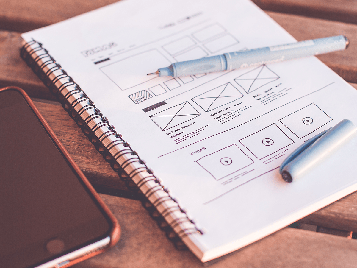
In our modern world today, you can hardly see people not having a gadgets i.e like phone (smart phones to be precise), And along that a vast amount of applications are being used daily, every second and that includes browsing through the internet to surf and search for what ever it might be.
And that comes in a good web design will take it’s power and effectivity, you might not notice it but most of us are likely to stay on a website and continue to browse because the content we really are looking for is in it or maybe it is because the site looks comfortable that it makes us wants to stay and explore more in that site.
Now the point is that with a good web design you will increase the traffic of your site or maybe you just simply want to make the site you own or you work with as beautifully designed.
If you are a web developer this will be a good strategy to always have all the site you work with as good designed as possible because you might want to include as many sites to your portfolio as possible.
With all that in mind, this is a few tips to help you make the web design as professional possible.
1 – SPACING
This is what most web developer are not taking seriously, spacing might just be too small of a task to do but it affect how your site will appeal to users.
Here’s a comparison of bad spacing and good spacing:

As you can see on the figure, The spacing on the left is bad that you don’t want to read it while the spacing on the right is pleasing to look at.
Try this technique, and you will improve the design of your site.
Just don’t do over spacing as it will result the same way as that of too narrow of space.
2 – FONTS
Font is a good designing foundation of a website as same as above, like good white spacing the site will be more attractive to the eye if the font you choose is perfectly fitted to the sites layout and feel.
You don’t need to overthink of what font you will use, just choose a font that is more readable and less complex to the eye.
here is a sample:

Both this font is a good font and can be use depending on the feel of the site it is neing used to. However the font with (check) is more flexible and can be used in much more layput situation without making things to look awkward.
Try to practice this and you will make your site more professional looking as before.
3 – COLORS
Obviously this is the most powerful element of one’s website because as you open the site, color is what our eyes will likely to perceive first.
With good color choice, the site you are working with will be on different level and will affect the traffic of your site, again you might not care if you will have good traffic to your site and just want to make youre site look professional, that is fine as well.
There are a lot of color techniques out there that a designers are using to achieve such feel they want on the site like if they want the site to feel fun they would use color that are lively, if they want to make the site feel serious they would use a darker colors, same to other feel they want.
The most common technique is the 3-4 way colors (primary, secondary, accent, base) this is by far the most effective way of using colors to your site, there are other techniques but we will only discuss the 3-4 way color as we don’t want to be over complex in this article.
If you are not a designer and cant think of a better color combination, you can just use a chromatic technique (this is the use of single color, then to make it 3-4 way you will add the dark of the color you choose and the lighter version of that color)
There are also a lot of color pallet tools out there, go search for it to assist you on choosing the perfect color combination for your site.
Here are samples of 3-4 way color pallet:

This might be the hardest skill to master out of the few but learning this will take your site to another level.
4 – SIZES
Now this applies to all elements within the site from texts, images, cards, icons, etc. some developers (or if you don’t call yourself one its fine) are not taking the sizes too seriously, they are just go default let the site size its element, just go with it, it’s a waste of time it will be just the same elements anyway. O boy that is a sad but a reality to most of us out there.
If you want your site to be more professional looking you must not let thia one technique slides through your palm.
Look at this for example:

As you can see, all the above techniques is applied to it but just focus on the perfect elemet sizes that is used in with it.
From card to buttons and to the texts are perfecly sized that in combination fit together nicely.
“How can I decide if the element is too small or too big?”, this is a rather situational by users age for example some old user would preferred large enough element for them to easily translate everything in the site, and some of the younger user would want smaller elements to fit much element as possible on the screens so they dont have to scroll too much on the site but likely younger user can go to any sizes to to narrow it down sizes can be most beneficial to older user.
There is A default size of elements so the suggested would be to increase the size a bit but not too much. To put it on numbers (in buttons its ideal to go on a 35px – 40px of height).
ADDITIONAL THINGS TO CONSIDER WHEN IT COMES TO DESIGNING THE SITE

That is all the basic techniques that you can consider doing to improve the design of the sign you are working with or planning to work with.
If you have more thoughts and questions about the techniques let anyone know in the comment section below.
Tags: web design, simple, effective, guide, user experience, visitors, website, visually appealing, functional, lifethinkler

